nCovMemory An Analysis
Articles on maps
- Introduction
- Number of articles per publication’s places
- First 100 places’ occurence in nCovMemory corpus
Introduction
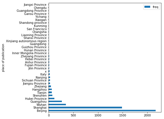
The first map shows the number of articles per publication’s places. The data to generate the map and the graph comes from this dataframe that I created. I did my best to extract the places of publication for each media. For newspaper or any other official media, it is rather easy to find. For a blogger, like an exchange student in Europe who came back to China, it is harder to select a place, that is why I chose to use the location provided by WeChat for every account on the app. Because the majority of articles were published on this app, this is the main source of location for the Number of articles per publication’s places. The graph was quickly made using Python instead of R that is why it looks different then the other graphs. The code to generate the graph and the map is available here.
The second map shows the first 100 places’ occurence in the nCovMemory Corpus. The places are extracted with Jieba. Then we can count how many times a places appear in the list and get rid of errors if necessary (the places’ extraction do not work 100%). For more details, check the code here.
Number of articles per publication’s places
